Jason's Articles
UX Best Practices for COVID-19 Exposure Notification Apps
Book Review: Universal Principles of Design
Review of Popular Weather Websites
UX Best Practices for COVID-19 Exposure Notification Apps
I served as lead author on a white paper about best UX practices for exposure notification (contact tracing) mobile apps. It was a great experience collaborating with an international team of volunteers. You can read the paper here
Book Review: Universal Principles of Design
Last month I had the pleasure of reading "Universal Principles of Design" by William Lidwell, Kritina Holden, and Jill Butler. I will talk about the structure of the book, the content, and how it could be applied to UX design.
The authors of "Universal Principles of Design" go through 125 principles of design that can apply to not only graphical user interfaces, but also print design architecture, etc. This book effectively consolidates these principles from fields such as physics, anatomy, etc., saving the reader the Herculean tasks of deciphering specialty texts in a variety of fields and distilling design maxims from them. "Universal Principles of Design" is a departure from most other UX-related books that I enjoyed reading, but it is proof that UX inspiration can come from multiple angles.
The principles are presented alphabetically, but the table of contents groups them by what the reader would like to accomplish through design. Each principle has the same two-page format; most of the 1st page is devoted to explaining the principle, with a paragraph saying how to apply it to design. Two to five allied design principles are listed at the bottom of the page if the reader wants to go right to them. The second page has some rich visual examples of the principle in practice.
A good example of one of the principles outlined is dubbed "Garbage In-Garbage Out". It states that the quality of system output is dependent on the quality of input. The book cites the scenario of having one field called "Full Name" in a form. Such a field would be quicker for the user to key in but would cause a big problem downstream when the system tries to use this input. As a UX designer, I would be willing to make some sacrifices in form efficiency if it saves the big headaches that I have experienced coming from handling garbage data. It is through easily digestible examples like this that the book shines as a design reference.
Some of the other principles are quite different but can also be applied to UX design. For instance, the "Most Advanced Yet Acceptable" principle says that products that are innovative are more accepted by the masses if they resemble more traditional predecessors of the product. A more advanced chair will not be successful if it does not to some extent resemble traditional chairs. The book reinforces this principle by citing other examples. A UX designer can apply this principle to an app or software by making more incremental changes to previous versions or competitor's products, and not get too radical in each implementation iteration.
I highly recommend "Universal Principles of Design" as a reference guide for design inspiration. I initially read the book front-to-back, but I can easily picture myself rereading individual principles as I want design inspiration, and then branching out into related principles using the book's "Also See" feature. Check out the book's website here , as well as some short reviews of it at GoodReads
What's New in Axure 8
Around August 2015 Axure 8 Beta was released, and a few weeks ago Axure 8 became available for purchase. This release was a big deal as 86 of the Fortune 100 companies use Axure to communicate design ideas. I am a heavy user of Axure since version 5, and decided to give Axure 8 a spin. I have listed some of the new and enhanced features of Axure 8, along with some thoughts.Payment Structure
Axure's subscription option follows the trend to make software available on a monthly basis. This is a model used by Adobe and Microsoft Office, among others. Unlike Adobe, however, Axure still allows buyers to pay a one-time fee. I welcome this flexibility. Indeed, there are now 3 tiers: Pro, Team, and Enterprise. For Pro and Team, a perpetual license can be obtained, or a monthly subscription. Basically Axure 8 Pro offers all of the functionality 7 Pro had with the exception of having team projects, and 8 Pro costs the same as 7 Pro. The team projects feature is available for an extra $20 a month or an extra flat fee of $400. Unfortunately this is a big jump in price for those who wish to collaborate (in other words, organizations with more than 1 user experience designer). Axure for Enterprise, which I will elaborate on later, can only be obtained via subscription, and it costs double that of Team. Axure's page on payment options.Snapshot
This new feature has been heavily promoted by Axure. It allows the user to capture an image of a page or Master, and use that image in another page. That image is dynamically updated when the original page updates. The Axure site says this feature is useful for showing the flow of an interaction. Indeed, this can be another tool in a wireframer's arsenal to help developers and other roles understand the wireframer's interactions in a clear manner. I believe snapshots can also be used effectively for training documents and flow diagrams. I look forward to mastering this feature. Axure's page on the snapshot widget.Collaboration
While a big step up in price, Axure for Enterprise does provides enhanced collaboration. I can see this being quite useful with teams of multiple user experience designers as peer feedback and Axure libraries are available in one repository. Also, team projects can be uploaded to AxShare, reducing the silos between user experience designers on a team. These enhancements in turn may help reduce inconsistencies in wireframes and miscommunications among team members. Axure for Enterprise page.Groups
The main purpose of dynamic panels in Axure is to allow a set of widgets to have different states. However, I would often be creating dynamic panels as workarounds. For instance, if I wanted to hide a widget in Axure 6 or earlier I would have to convert the widget into a dynamic panel and then hide it. Fortunately this workaround was rendered moot in Axure 7 as widgets could be hidden. In Axure 8, grouped widgets can have interactions assigned to them. This is quite helpful when a button or other widget has multiple components to it. For instance, when representing a button that has an icon in it. No dynamic panel needed, and no need to assign an action to every component. Axure's page on groups.Notes
With Axure 8, widget notes can be more customized. While a seemingly subtle update, this can result in a more polished-looking spec, so I view it as a quick win. It would reduce the amount of time I would spend doing post-hoc editing on a generated spec. Efficiency for the win! Axure's support page on notes.Default Library
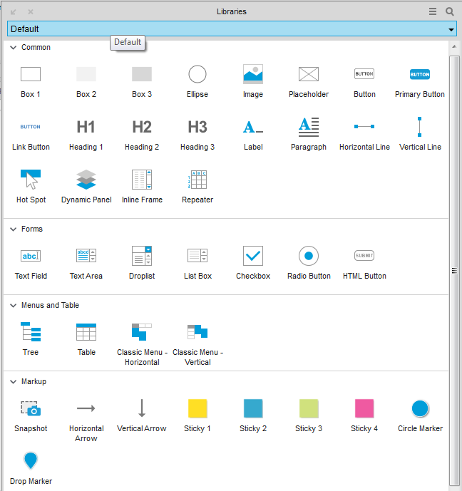 Some additional widgets are added right out of the box. While they might be helpful, it increases the number of widgets a user has to wade through in order to find the right one. I question the usefulness of having 4 types of stickies and 3 types of boxes in the default view, when what I usually want is a radio button or dropdown. Granted, my complaint is mitigated somewhat by the search widget feature. Axure's page on libraries.
Shapes
The user now has some ability to create custom shapes through uniting, adding, subtracting images, and other vector drawing features. While some may prefer to leave such functionality to Fireworks or other software and import them into Axure as an image, I find this functionality useful and I argue does not get in the way of those who choose not to use it. I believe this would reduce the frequency of going to another piece of software to communicate my design ideas, and I am all for that streamlining. Axure's page on shapes.Repeaters
 A gripe I have with Axure 7 that did not seem to get fixed in 8 is that with the repeater does not handle cells with varying number of lines of text well. I tried the "Fit to content in HTML" feature but the content still looks funny. This reduces the usefulness of the repeater as I often find myself in such a scenario. More polishing of the Repeater widget would be nice. Axure's page on repeaters.
Overall
The changes from Axure 7 to 8 are a bit more incremental than from 6 to 7, as 7 introduced repeater and enhanced responsive wireframing support (among other features). However, I believe there are enough enhancements to make it worth the upgrade; especially since the update from 7 Pro to 8 Pro is free. It will be interesting to see if Axure can maintain its leadership position as a user experience design tool.Review of Popular Weather Websites
Everyone talks about the weather but no one does anything about it. That being said, we do have the choice of how we consume our weather information. Do certain weather websites deliver a better user experience than others? I selected 3 popular weather websites to compare: weather.com, Weather Underground, and Accuweather. Weather.com is by far the most popular of the weather websites out there in the United States, while Weather Underground and Accuweather are among the top 150 sites in terms of traffic in the United States. To aid in determining what to focus on in this review, I surveyed 12 respondents, asking them what are the 3 most important tasks that a weather website should facilitate. The responses are summarized in the table below. Because of these responses, I decided to focus on forecast data, and not so much on historical weather data and news articles.| Task | Respondents |
| Current Weather | 4 |
| Hourly weather | 4 |
| Precipitation chances | 4 |
| Extended forecast | 4 |
| Weather in other places | 4 |
| Forecast | 3 |
| Today's forecast | 2 |
| Morning weather | 1 |
| Daily forecast | 1 |
| Temperatures | 1 |
| Tomorrow's forecast | 1 |
| Forecast for weekend | 1 |
| Forecast storms | 1 |
| Hourly radar | 1 |
| Allergy level | 1 |
| Need to wear jacket? | 1 |
Home Page
Too much of the prime screen real estate of weather.com is taken up by a weather article that is not local to most people. Since survey respondents mainly wanted current weather data and forecasts, those items should be more prominent on the page. I do like that weather.com's header is sticky, meaning it stays at the top of the page as the user scrolls. Indeed, this is a good usability practice.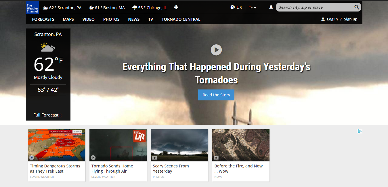

Current Conditions
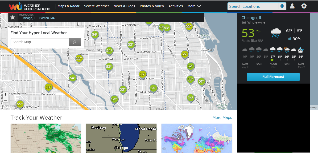
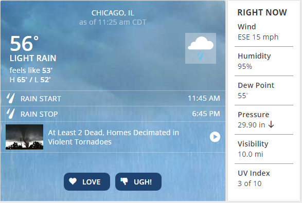
On weather.com, the current weather conditions are displayed in large text on the left for the city it deems you closest to. I feel though that it is obfuscated by the home page's splash image for its leading news article. I do like how a 1-2 word summary of the weather is displayed to supplement the weather icon, as icons are often hard to interpret on their own. On Weather Underground, geolocation is also used to deliver the current conditions for the closest weather station. The temperature is displayed in large text, which is good, though the current weather icon has no descriptor. While Accuweather also uses geolocation to deliver the current local weather on the home page, not a lot of visual emphasis is given to it. In fact, the the current conditions in Miami and New York City are given almost as much emphasis as my city. On the plus side, like weather.com, I like how a descriptor of the current weather is included.Local Forecast Page
On Weather Underground, a prominent link to the local daily forecast on the homepage makes that functionality a click away. I like the fact that the entire 10-day forecast is visible when landing on the local forecast page. The content at the top and middle of the page is deals almost exclusively with local forecast data. A minor gripe is that the weather icons do not have the visual polish of Accuweather's.


Hourly Forecast
The hourly forecast on weather.com consists of a table; while this is adequate, a graphical representation of the temperature, precipitation probabilities, and trends would allow for easier digestion of the data.The weather is also available in 15-minute intervals upon expanding a certain hour entry. This is good as it allows for enhanced functionality without getting in the way of those who just want the hourly forecast. The hourly forecast in Weather Underground, a feature deemed important by respondents, is also displayed in the home page. Hourly trends are displayed in line and bar chart formats which I feel more effectively tells the story of temperature, precipitation trends, and weather in general. For those who prefer the table approach, that view is just one click away. Accuweather is somewhat in the middle between providing tabular and graphical representations of the hourly forecasts. Rain, snow, and ice probabilities are graphically represented for enhanced scannability. The table scrolls horizontally though, which is not as desirable as the vertical scrolling of weather.com and Weather Underground.

